19 Amazing Living Room Paint Color Ideas You’ll Love: How To Nail The Perfect Palette For Your Home
This blog post is all about living room paint color ideas.
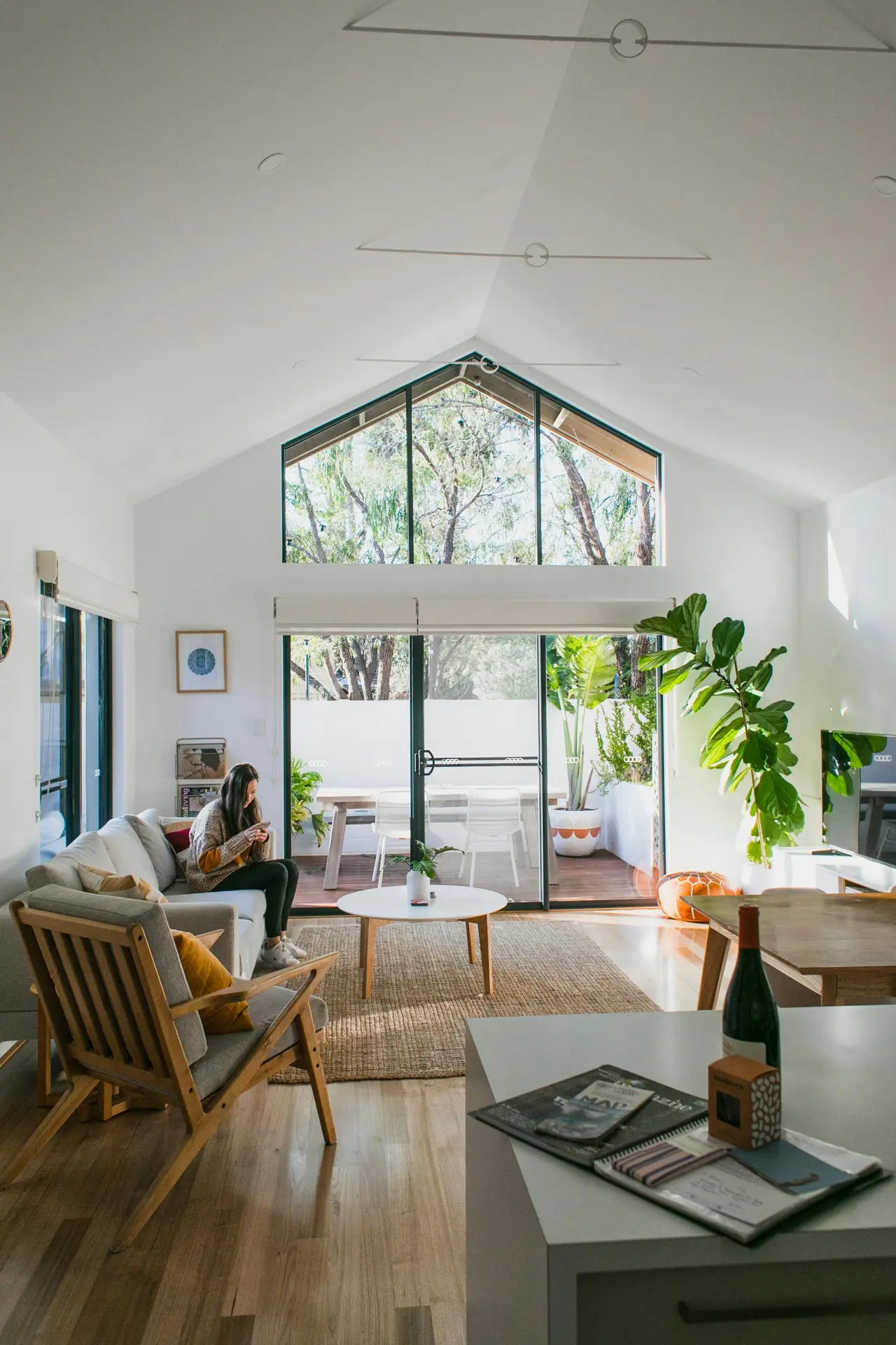
 Save
Save Choosing a living room paint color sounds simple, until you’re standing in front of dozens of swatches that all look the same under store lighting.
I think the truth is, you can’t choose the “perfect” color by only seeing it painted on a tiny card. You also have to consider how light moves through your room, how the walls interact with your furniture and how the room looks at different times of day.
I have to admit: Complying with all of that can be somewhat overwhelming. But I’m here to help!
In this blog post, we’ll explore the science behind a well-balanced color palette, walk through a practical step-by-step process from swatch to finished wall and share 19 living room paint color ideas you’ll actually love living with.
You’ll also learn how to coordinate new paint with what’s already existing and why the often-overlooked “fifth wall” can make or break the final look.
This site includes affiliate links, meaning I may receive a small commission, at no additional cost to you.
The Science Of The “Perfect” Palette
Picking colors for your living room doesn’t have to be guesswork. Here are a few things that actually help:
Check which way your windows face
The light direction changes how colors look:
- North-facing rooms get cooler, bluer light. Warm colors like beige or terracotta balance that out.
- South-facing gets warm, strong light. Cooler tones like gray-blue or sage look better.
- East-facing is bright in the morning, neutral at night. Soft, light colors work well.
- West-facing gets that golden afternoon light. Warm tones look especially good in the evening.
I recommend to always test your paint color in both daylight and at night with your lights on. Colors shift way more than you’d think.
Use the 60-30-10 rule
This is a basic design trick that keeps everything balanced:
- 60% main color (use it on walls, sofa, big rug)
- 30% secondary color (use it on curtains, smaller furniture)
- 10% accent color (use it on pillows, art, small decor)
My tip: You can swap the 10% accent seasonally if you want. For example, use sage in spring and rust orange in fall.
Pay attention to LRV
LRV (Light Reflectance Value) tells you how much light a color reflects. The scale is 0 to 100, where 0 is black and 100 is white.
High LRV = bright, reflects light, makes rooms feel bigger. Typical colors are white or light beige.
Low LRV = darker, absorbs light, makes rooms feel cozier but smaller. Examples are navy or charcoal.
For small or dark rooms, a higher LRV helps a lot. You can usually find the number on the back of paint swatches or on the brand’s website.
The Practical “How-To”: From Swatch To Success
To make your living room walls perfect, here are a few tips I’d like to share:
Don’t start painting right away
Many people make the mistake of painting small swatches of color directly onto the wall.
In my opinion, these mini color samples look too concentrated and don’t realistically show the color in the context of the room.
Better: Use large sample boards or A4 color charts and attach them to different spots in the room so you can compare the effect under different lighting conditions (morning/evening, sun/shade, natural/artificial light).
My tip: Always observe the color for at least two days before deciding on the shade.
Choose the right sheen
The sheen of the paint affects both the appearance and the cleaning and durability.
- Matte looks elegant and modern, but is more delicate. That’s why I recommend using matte paints on ceilings or walls that don’t get much wear.
- An “eggshell” sheen is like a subtle shimmer, and the best part? This sheen is wipeable, making it perfect for living rooms or hallways.
- Satin, on the other hand, has a distinct shine and is very durable. This makes it ideal if you have children or pets.
My tip: Use the same color but work with different sheens.
Preparation is everything
The most beautiful color only looks its best on well-prepared surfaces. Therefore, I advise you to carefully fill and smooth any holes, cracks and dowel marks.
I would also recommend using a primer. This ensures even paint absorption and extends the paint’s lifespan. A good primer is essential, especially when transitioning between colors (e.g., dark to light).
My tip: A lightly sanded, clean surface will save you a second coat of paint later and ensure a smooth finish.
Living Room Paint Color Ideas
Next, I’d like to show you some specific color examples, ranging from dark to light, that can make your living room feel cozy, fresh, spacious or striking.
I think there’s something for everyone among these 19 different living room paint color ideas.
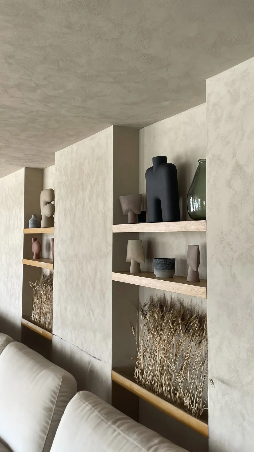
1. Warm Beige
 Save
Save I think warm beige is always a good choice for a living room wall color.
In my opinion, it looks timeless, calming and inviting, which also makes it perfect for open-plan living spaces.
Warm beige creates a warm atmosphere without any unpleasant yellow undertones.
I would combine warm beige with a cream-colored sofa, wood and rattan details (e.g., a coffee table or tray), white linen curtains and dried flowers in glass or white ceramic vases.
Personally, I absolutely love the combination of beige and white.
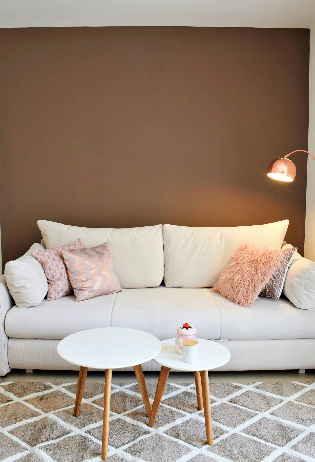
2. Pink Accent Wall
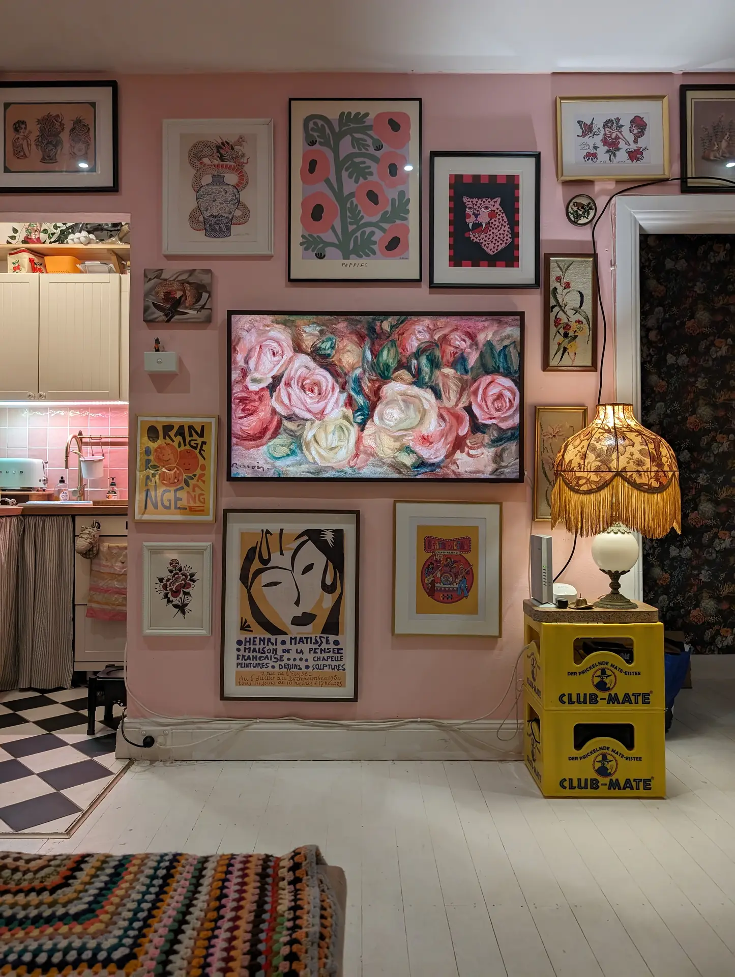 Save
Save If you like a bold statement, consider painting a pink accent wall in your living room.
Don’t you think pink brings freshness, vibrancy and a touch of playfulness to a living room?
I think such a wall works wonderfully as an eye-catcher behind the sofa or a bookshelf.
My decorating idea: Combine the pink wall with neutral furniture in white or beige. I can particularly imagine gold candlesticks and statement pieces in rose or copper tones as striking accents.
Related: How To Decorate A Bookshelf (+16 Bookshelf Decorating Ideas You’ll Love)
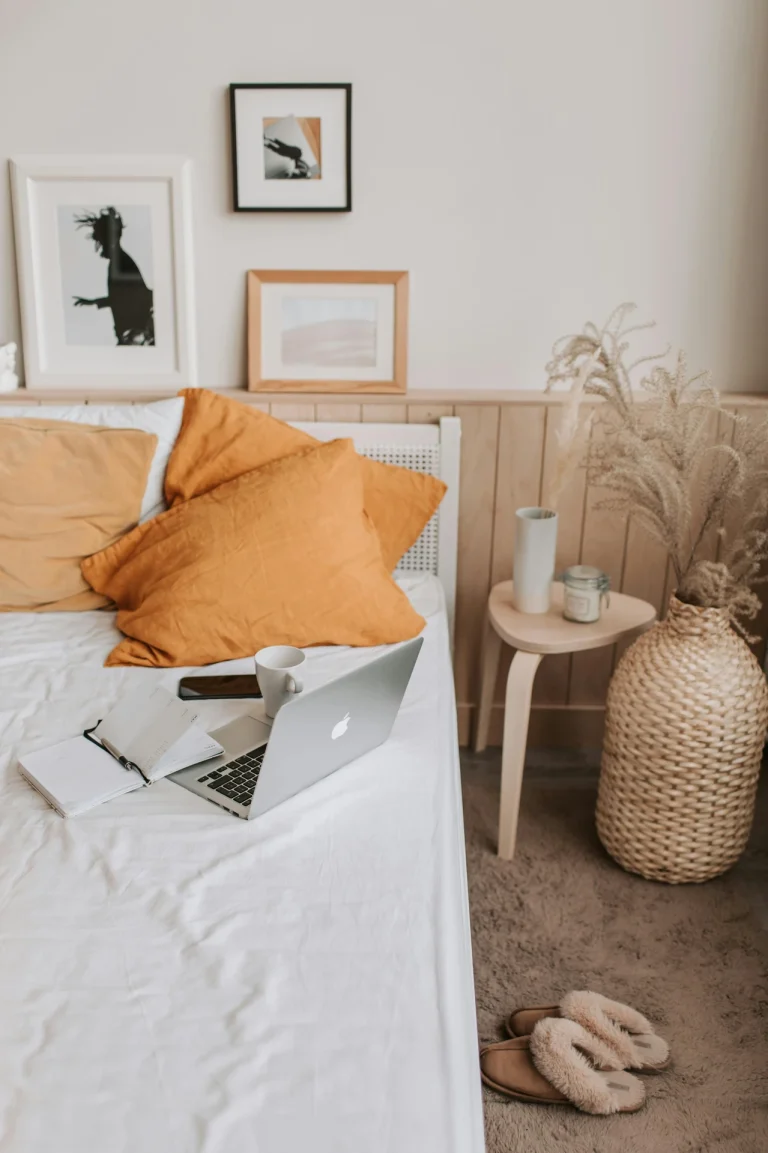
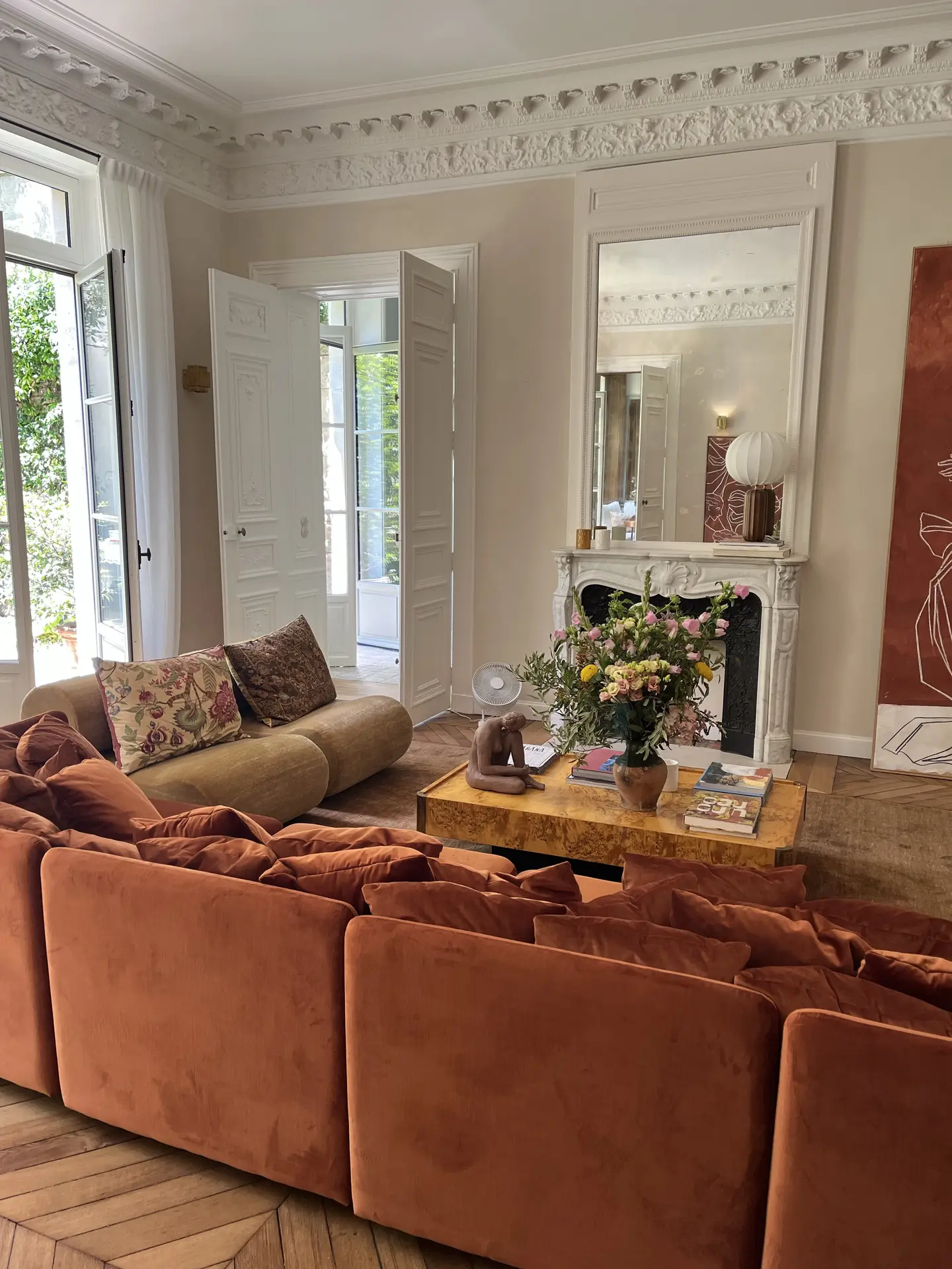
3. Burnt Orange – Living Room Paint Color Ideas
 Save
Save Burnt orange is an earthy tone that exudes coziness and energy.
I especially like it in combination with natural materials.
My tip: Combine burnt orange with cognac-colored leather, dark wood and green plants. Warm light (e.g., from linen lampshades) completes the overall look and complements the warm color scheme.
4. Warm Cream
 Save
Save If you like things bright, cheerful and classic, warm cream might be just the color for you.
I think warm cream works well in any room, regardless of size, but it’s especially perfect for small spaces because it visually opens up the room and makes it appear larger.
And the best part? Warm cream goes with furniture of virtually any color.
If you like the bright, clean-girl look, you could combine warm cream walls with a white sofa, light wood, beige cushions and a lemon tree in a terracotta pot.
5. Limewash Beige
 Save
Save If you find beige on its own a bit boring, I’d like to introduce you to limewash beige.
The natural, matte texture creates depth and character, making the walls appear dynamic and interesting.
Personally, I would combine a limewash beige wall with a stone vase containing olive branches, ceramic bowls, linen curtains, and sofa cushions in greige and white.
The “Mediterranean Minimal” look works particularly well with limewash beige.
Related: The Ultimate Guide: 13 Curtain Ideas For The Living Room (You’ll Wish You Tried Sooner)
6. Greige Blue – Living Room Paint Color Ideas
 Save
Save I find the combination of gray and blue creates a calm, elegant and modern look.
Greige blue is therefore the perfect background color for neutral or black furniture.
My decorating idea: A black coffee table, a white vase with eucalyptus, gray cushions, and light-colored rugs.
7. Mustard Yellow
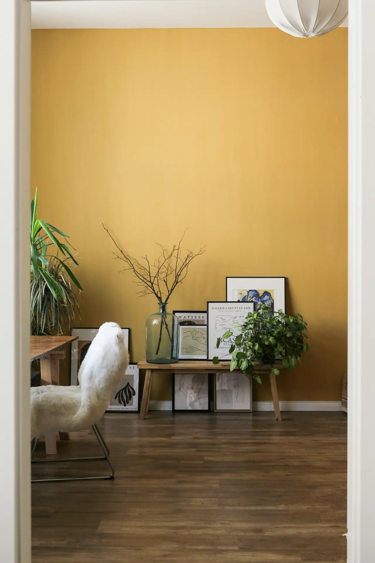 Save
Save Don’t you think mustard yellow brings a real retro charm to your living room?
It also has a warm feel, which I personally love.
It looks especially vibrant when daylight and sunshine hit it.
I think it looks best with wooden frames, beige rugs, gold accents and glass vases.
8. Aqua Blue
 Save
Save Aqua blue simply exudes this fresh, airy and energetic feel, which is why, in my opinion, it’s also an ideal spring color.
In my view, the color works particularly well with white and light gray furniture.
Glass vases with white flowers, a light-colored sofa, silver accents and cotton textiles look absolutely beautiful in combination with aqua blue walls.
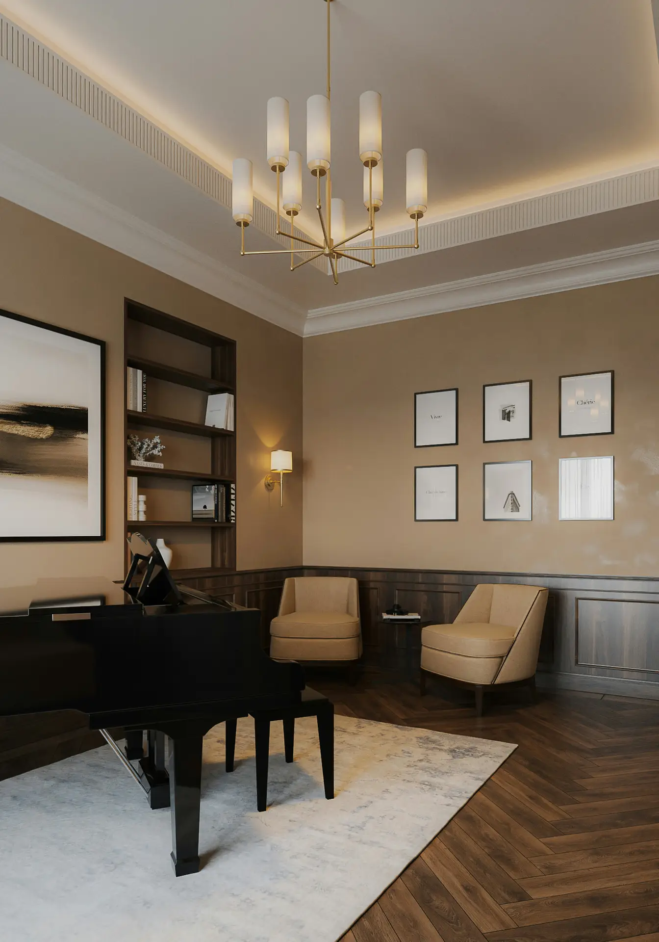
9. Mocha Brown
 Save
Save Do you love deep, earthy tones that give your room a luxurious, cozy feel? Then mocha brown might be just the color you’ve been looking for!
Mocha brown doesn’t feel cold at all, quite the opposite, in fact: The color creates a sense of warmth and stability.
If you’re wondering what goes well with mocha brown walls, I would recommend cream-colored sofas, dark wood tables, gold lamps, and plants with large leaves.
10. Cement Wash Grey
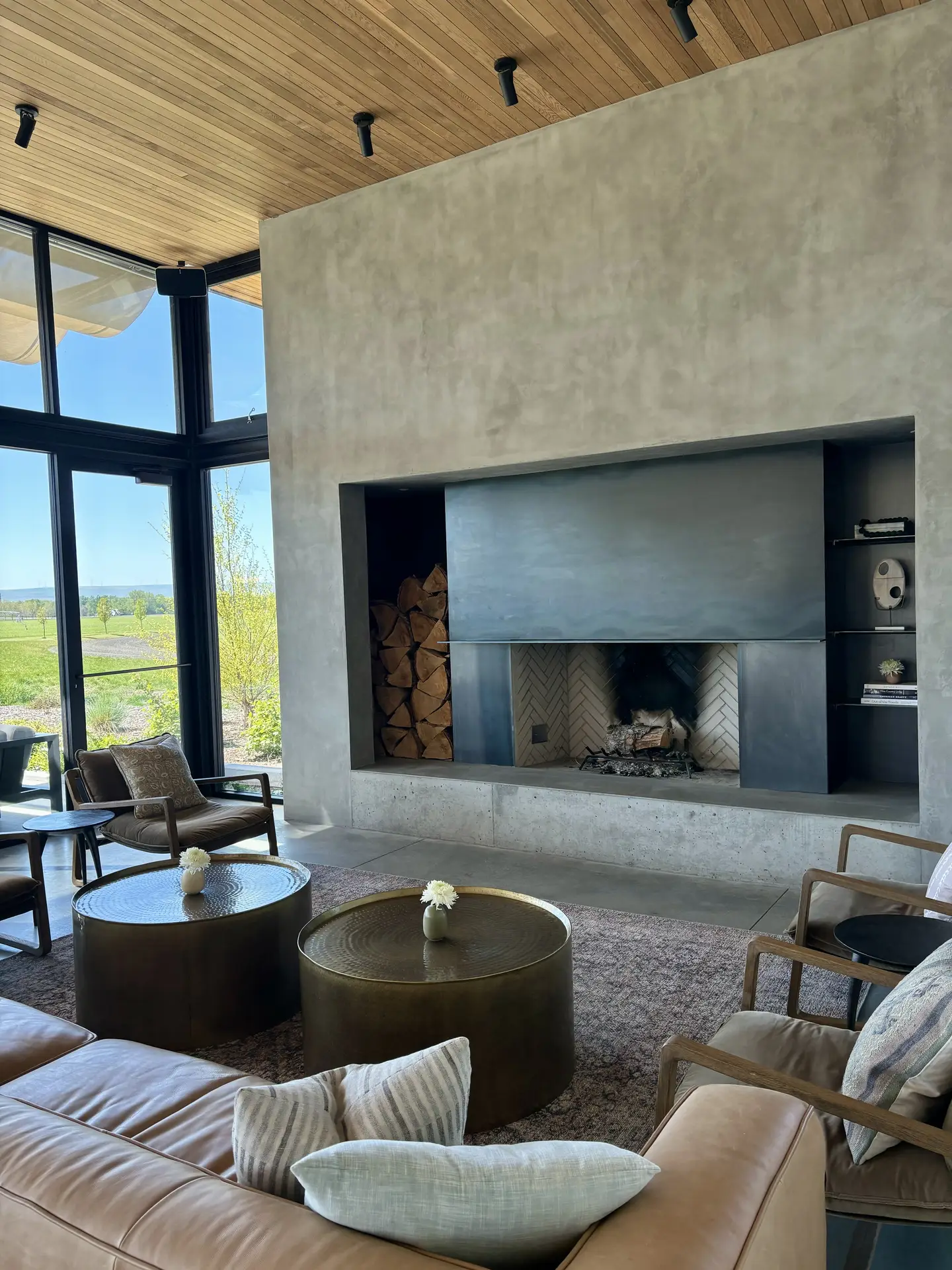 Save
Save Cement wash grey brings a modern industrial look to your living room, while maintaining an urban and calming feel.
The matte finish also adds a touch of texture, making your living room look more interesting.
Personally, I especially like cement wash grey with black metal accents (e.g., shelves or lighting fixtures), copper vases and plants with large leaves.
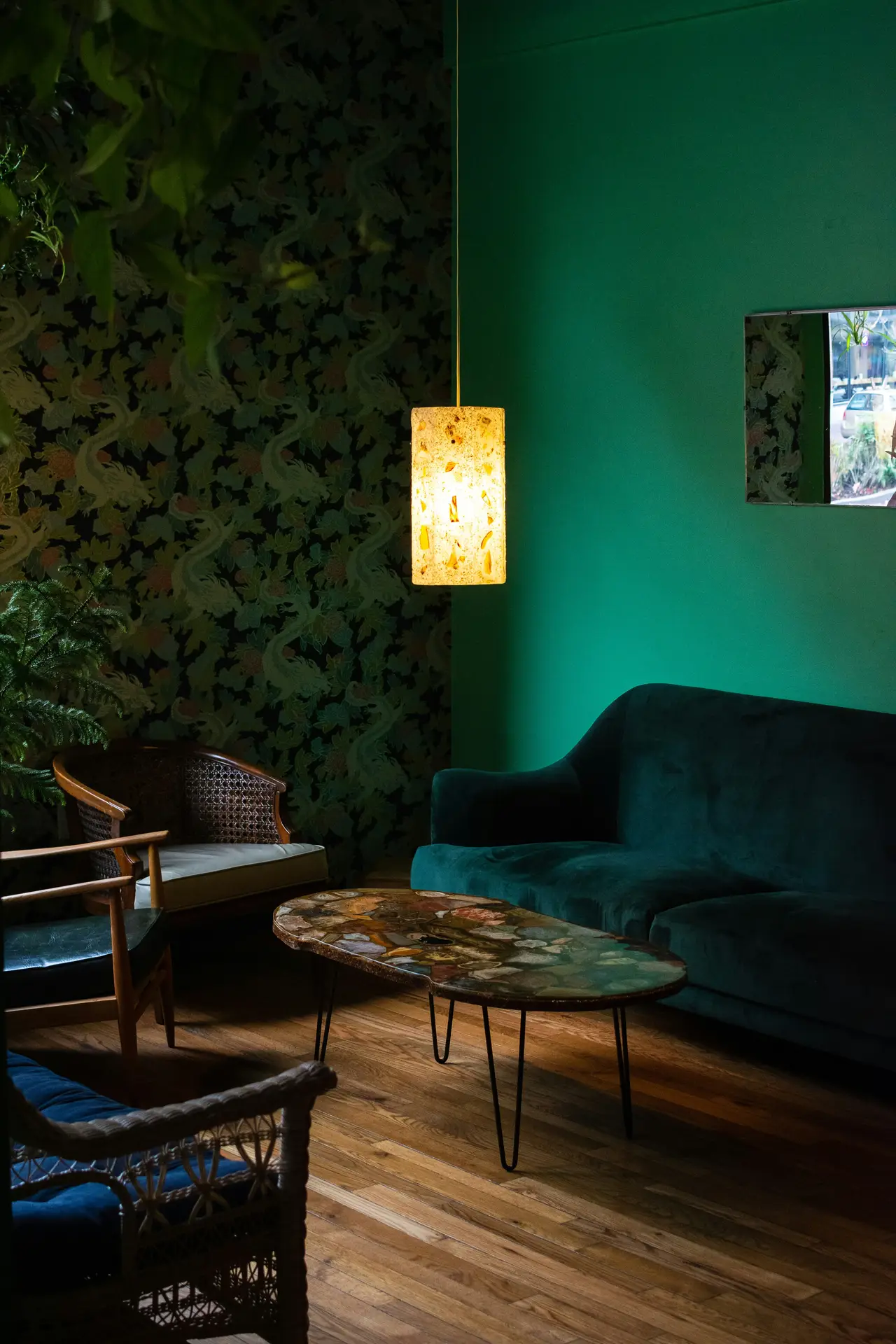
11. Petrol Blue – Living Room Paint Color Ideas
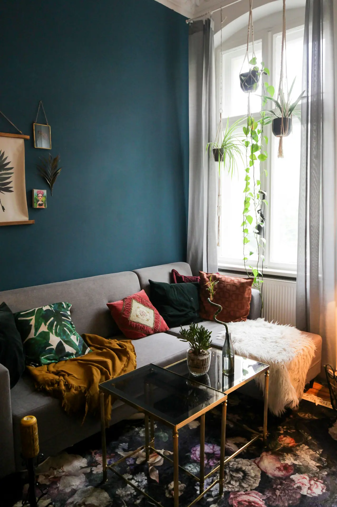 Save
Save This color is perfect for those who appreciate elegance, vibrancy and a sense of calm!
Petrol blue perfectly embodies these qualities and, in my opinion, looks especially sophisticated when paired with metal.
My tip: A dark gray velvet sofa, brass lamps, wooden floors and cream-colored rugs work particularly well with petrol blue.
Related: 21 Living Room Decor Ideas For Walls To Get Inspired By
12. Pale Grey With A Hint Of Green
 Save
Save Pale grey with a hint of green is a special color.
It conveys a subtle freshness, making it ideal for bright rooms.
This color is also the perfect example of a superb balance between cool and warm undertones.
I particularly like pale grey with a hint of green when combined with wooden frames, white ceramics, linen fabrics and green plants that echo the hint of green.
13. White Walls
 Save
Save Even though some might find it boring, simple white simply has to be on my list.
White is and remains the classic choice for timeless clarity and maximum flexibility.
It makes colors and shapes stand out more in a room and practically everything goes with simple white, whether you opt for wooden furniture, colorful cushions, or black accents.
14. Emerald Green
 Save
Save Emerald green is a rich, rich color that, in my opinion, exudes elegance and luxury. It simply looks sophisticated!
Gold and brass details perfectly complement the look, I think.
I would opt for a grey sofa, round gold side tables, glass vases and dark wood accents.
Related: The Ultimate Guide On How To Style A Grey Sofa In Your Living Room (+17 Stunning Ideas)
15. Antique Rosé
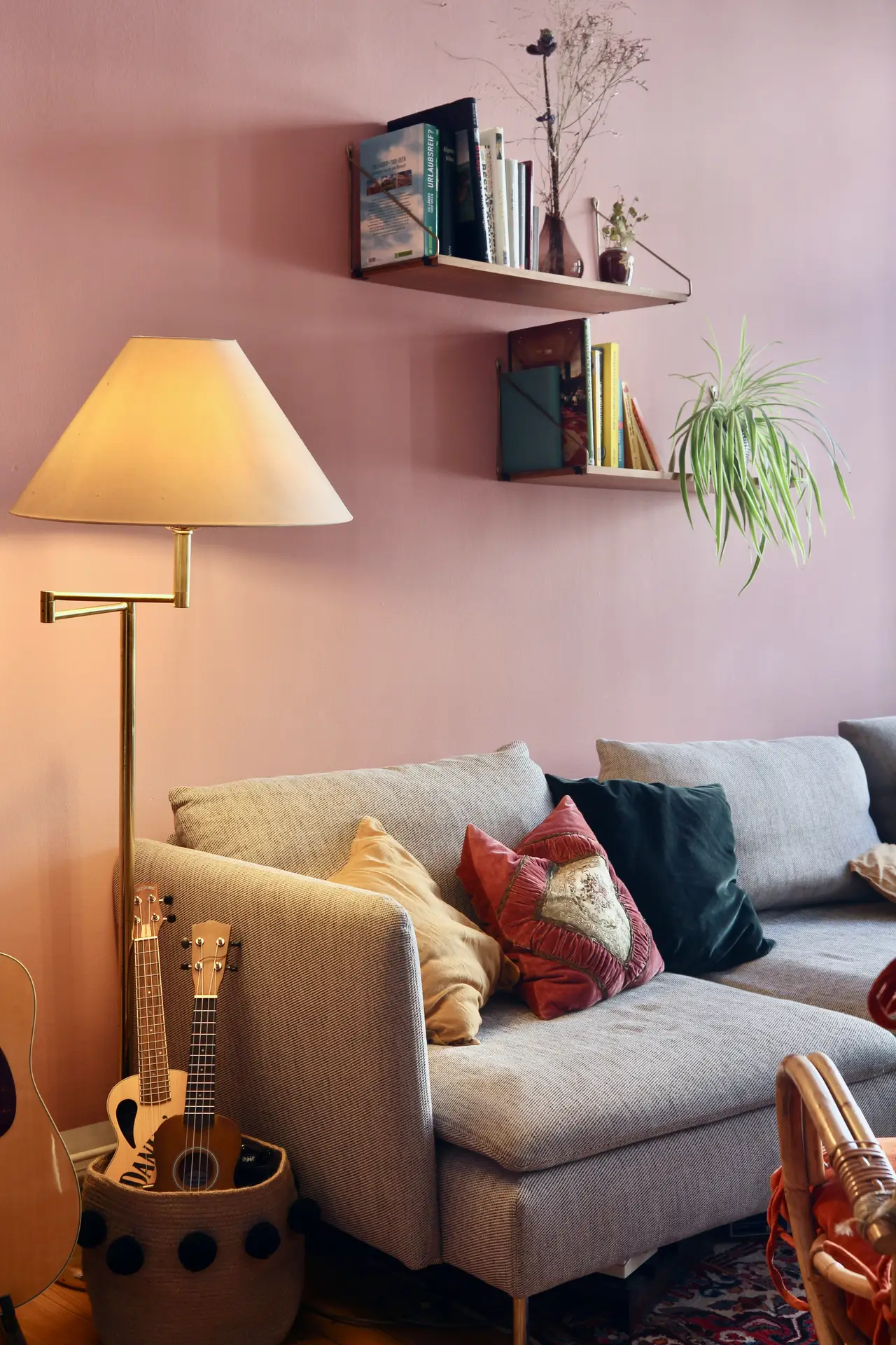 Save
Save Antique Rosé exudes a romantic, warm and soft vibe without being kitschy.
I think this color works particularly well in feminine, modern living spaces or with white vintage furniture.
I would also suggest combining it with a white sofa, a coffee table with a marble top, gold candlesticks and dried flowers in soft tones.
16. Pale Sage Blue
 Save
Save Are you familiar with the color pale sage blue? If not, let me introduce it to you.
Pale sage blue is a soft, grounding and harmonious color.
I find it creates a sense of calm and works particularly well in light-filled rooms.
In my opinion, beige tones, linen fabrics, wicker details and small olive trees look especially good with pale sage blue.
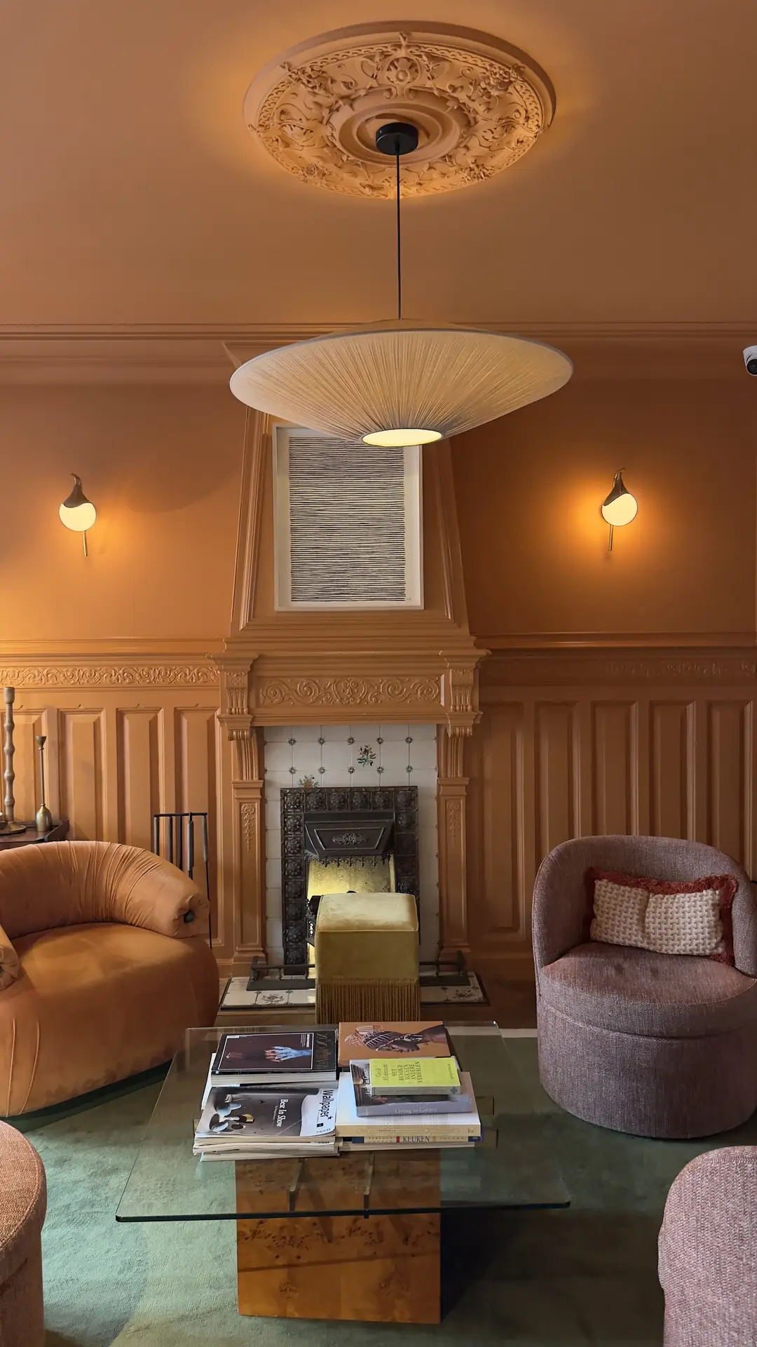
17. Warm Caramel
 Save
Save Are you still looking for a cozy and inviting color that perhaps evokes the autumn sun?
Then warm caramel might be just what you’re looking for!
Personally, I think this color works especially well with white, black or dark blue.
But I can also easily imagine brown leather armchairs, wool rugs, white candles and dried flowers in terracotta vases pairing beautifully with warm caramel.
18. Alabaster White
 Save
Save Alabaster White is a creamy white with warm undertones.
Don’t you think alabaster white looks elegant and soft?
What I like about this color is that it can be combined with almost any other color.
My decorating idea: Combine alabaster white with textiles, glass lamps, light wood and dried grasses.
19. Deep Black – Living Room Paint Color Ideas
 Save
Save Okay, for one last color, I have one that’s only for the truly daring! How about a bold, rich black?
Black walls look modern and dramatic.
You don’t have to paint all the walls black, an accent wall can be enough.
Artwork really stands out against a black wall.
I also think that metallic details go particularly well with this look.
My decorating idea: Gold lamps, glass vases, a gray sofa and green plants for a touch of freshness.
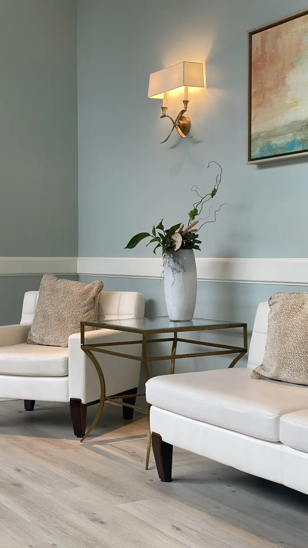
Coordinating With What You Can’t Change
Your wall color needs to work with what’s already in the room and can’t be changed quickly, like your floors or your furniture.
Let’s take a closer look!
Match your floor
The floor is the biggest color block in the room, so it sets the tone.
- Warm wood floors (e.g., oak, walnut, pine) look best with warm wall colors like beige, greige, taupe or terracotta.
- Cool floors (like concrete, gray vinyl or light tile) pair better with cool colors like soft gray, sage or muted blue.
A quick trick: Hold the paint swatch next to the floor, not up against the wall. You’ll see how they actually interact with color and light.
If you’re stuck, go with neutral bridging colors like warm white or soft greige. They work with pretty much anything.
Start with what you can’t change
Every room has fixed elements like a stone fireplace, dark window frames or your couch you want to keep.
I deeply recommend to not fight those, instead build your color scheme around them.
Here are a few examples:
- A navy velvet sofa goes well with sage, dusty rose or off-white walls.
- You own a rustic stone fireplace? Warm earthy tones like clay, sand and cream look great.
My tipp: Instead of creating contrast that clashes, repeat colors from your fixed elements in smaller pieces like pillows, frames or a rug.
This makes everything feel connected.
Pro Tip: The “Fifth Wall”
The ceiling matters more than people think.
But should you paint the ceiling the same color as the walls or is it better to leave it white? Let me explain!
When to paint it the same color as the walls:
The same color on walls and ceiling creates a cohesive, flowing look.
This works especially well in small rooms or when you’re going for a modern monochromatic vibe.
It’s also great for darker, moody colors where you want that enveloping feel.
When to keep it white:
Low ceilings? Always choose white.
A light ceiling makes the room feel taller and more open. Also if you need the ceiling to bounce light around the room, white does that better than anything else.
My final tip: Just skip pure stark white and use a softer white instead, so it doesn’t feel harsh or sterile.
Choose Wisely
When you’re picking paint choose what actually works with your light, your furniture and how you want the room to feel.
The best color choices are the ones that make sense for your space. This could be soft neutrals, darker moody tones or something bolder.
Paint is one of the cheapest ways to quickly change a room without buying new furniture. So don’t rush it.
I think the most important part is to test colors in your actual light, in the morning and by night.
And pick something that reflects how you want to feel in that room, not just what looks good in someone else’s house.
If you need more inspiration and ideas for home decor and organization, then you’ve come to the right place on my blog. Feel free to look around!
Did you enjoy this article?
If you’d like, treat me to a coffee ☕ Your support means the whole world to me!