Choosing The Right Color Palette For Relaxing Bedroom Walls: In Depth Guide + 15 Paint Colors For Your Bedroom
This guide shows you everything regarding paint colors for your bedroom!
 Save
Save You know that feeling when you walk into your bedroom after a long day and just feel more relaxed? A lot of that comes down to color.
The right shades don’t just look nice, they actually change how the room feels (and how you feel!). Soft neutrals calm things down, lighter colors make small rooms feel bigger.
I’m going to walk through why certain colors work, how lighting and undertones matter and how to actually pick a palette that makes sense.
You’ll also get some practical stuff on paint finishes, fabrics, materials, plus 15 actual paint colors you can use right now.
Whether you’re redoing the whole room or just want some fresh ideas, this should help you make it feel more like a place you actually want to be.
This site includes affiliate links, meaning I may receive a small commission, at no additional cost to you.
Color Psychology For Calmness
Okay, so starting with the obvious things.
Colors change how you feel in a room. That’s just a fact.
Softer, less intense colors relax you. Bright contrasting ones? They’re more energizing, which isn’t what you want in a bedroom.
Warmer beiges and taupes feel cozy. Greys and blues feel more open and cool.
Bottom line: Keep it muted and similar if you’re trying to sleep in there. And don’t go picking colors that fight with each other.
Understanding Light
Light changes everything about how colors look in your room and if you ignore it, you’re gonna be disappointed.
Natural light shifts all day long and then your lamps add their own thing on top of that. You need to think about both.
Here’s what to keep in mind:
Direction of Light
- North: Light tends to be cooler with a gray undertone, so balancing with warm or greige tones keeps the space from feeling flat.
- South: Sunlight here is warm and strong, meaning cooler or neutral tones help the room stay crisp and not overly yellow.
- East: Morning light is fresh and soft, making delicate pastels an especially good match.
- West: Evening light is warm and golden, so blues and greens can easily shift toward a muted gray if not paired thoughtfully.
Artificial Light
Choose bulbs in the 2700-3000K range with a CRI of 90 or higher for natural-looking colors.
Dimmers
Adding dimmers creates flexibility and makes it easy to shift into a cozy evening routine.
LRV & Undertones: The Technical Compass
When I’m picking a wall color, LRV and undertones are what keep me from screwing it up.
The Light Reflectance Value (LRV) basically tells you how much light the paint bounces back.
Colors in the 60-75 range look bright and feel open, good for making a room feel bigger.
Mid-tones around 35-55 give you that cozy, warm vibe.
Deeper ones between 10-35 make the room feel wrapped up and moody.
To avoid getting it wrong, I do this quick check: Hold the sample next to cream, pure white and black for like two minutes. You’ll immediately see if it’s warm, cool or neutral.
Super simple but it actually matters when you see the whole room painted.
Step-By-Step Guide To The Perfect PaletteCreating a cohesive color scheme doesn’t have to be complicated.
If you break it down into clear steps, it becomes a structured process you will master, I’m sure.
This simple framework I like to follow when building the perfect palette:
- Set Light & LRV Goal
Decide upfront whether you want an airy, light-filled atmosphere or a moody, cocoon-like space. Your target LRV will guide every other choice. - Choose a Base Wall Color
Start with a muted neutral or a softly toned color that feels timeless and sets the backdrop for the room. - Define Trim & Ceiling
For ceilings, either go with your wall color but cut it in half for something softer or just use a warm white to brighten things up. Trim and doors usually look best one or two shades lighter than the walls-gives it a clean finish. - Pick an Accent Color
Use an accent color for like 10-20% of the room through pillows, blankets etc. This keeps it interesting without being too much. - Match with Materials
Always test your chosen palette against the wood tones, metals (like brass, chrome or black) and fabrics in your space. The right alignment here makes the scheme feel intentional. - Test in Real Life
Paint some big sheets or grab those peel-and-stick samples, do two coats and stick them on a few different walls. Look at them in the morning and again at night to see how the color changes before you commit.
Finish/Gloss Levels (Bedroom-Specific)
The finish matters almost as much as the actual color. It has an impact on the overall appearance.
Walls should be matte or maybe eggshell. This way they look softer and hide any weird bumps or marks on the wall.
Trim and doors do better with satin or semi-gloss. This gives a little contrast and doesn’t get messed up as easily when you’re touching it or cleaning it.
And the ceiling? Just matte. Keep it simple so it doesn’t compete with anything else in the room.
Paint Color Ideas
From airy neutrals to rich, moody tones, the bedroom colors palette you pick sets the stage for every detail that follows in your bedroom.
Here are 15 inspiring paint color ideas to help you create a space that feels stylish and like you.
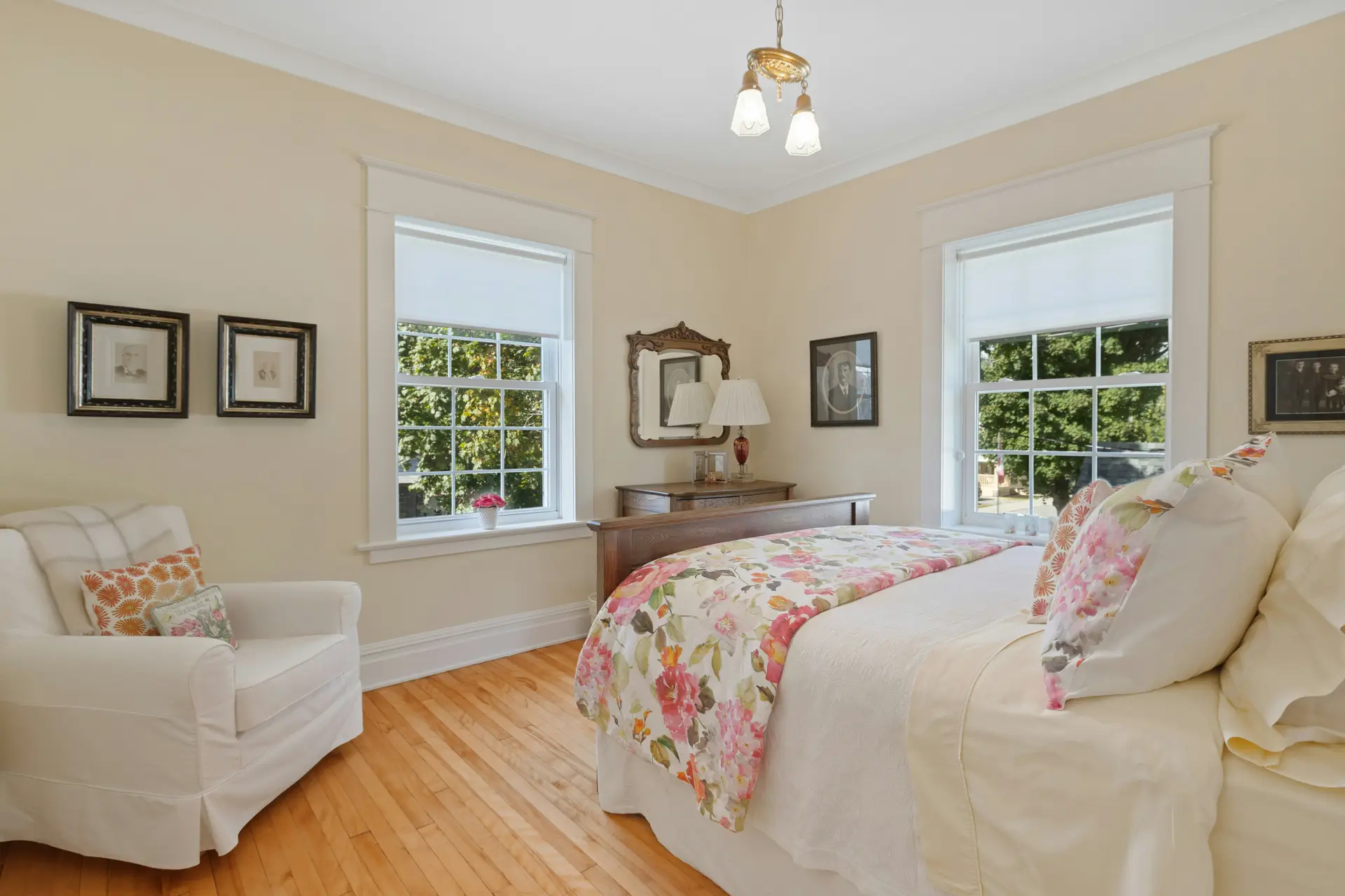
1. Beige
 Save
Save Beige just works as a background color.
It’s warm but not overwhelming and it makes a bedroom feel calmer.
Beige walls go well with white bedding and natural stuff-linen curtains, woven baskets, a wood nightstand, that kind of thing.
It just gives your room a classic, solid look.
If it feels too flat, put in some darker beige pillows or a textured rug. Little things like that add some depth without messing with the calm vibe.
2. Dark Green – Paint Colors For Your Bedroom
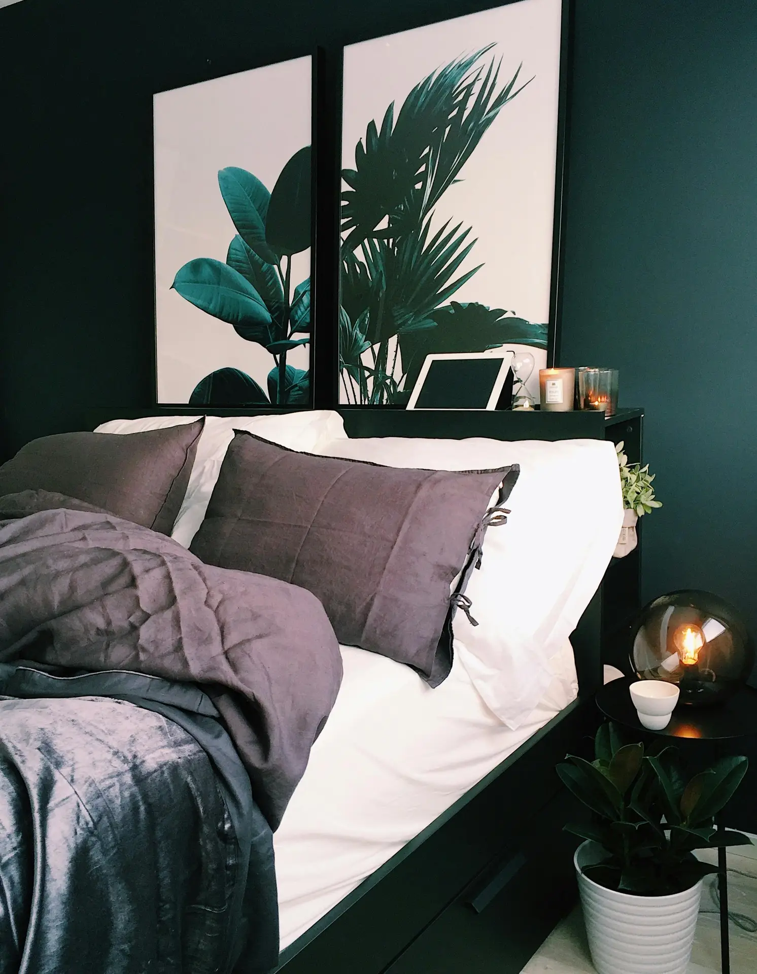 Save
Save Dark green gives me forest vibes and it has that same calming thing going on.
It makes me feel grounded like being outside does.
It’s perfect for an accent wall. But I recommend to don’t go overboard with it, balance it with lighter bedding, some wood furniture, maybe brass lamps so the room doesn’t feel like a cave.
Add a plant or two, a chunky throw, some art with natural colors. That pulls it together and keeps it from feeling heavy.
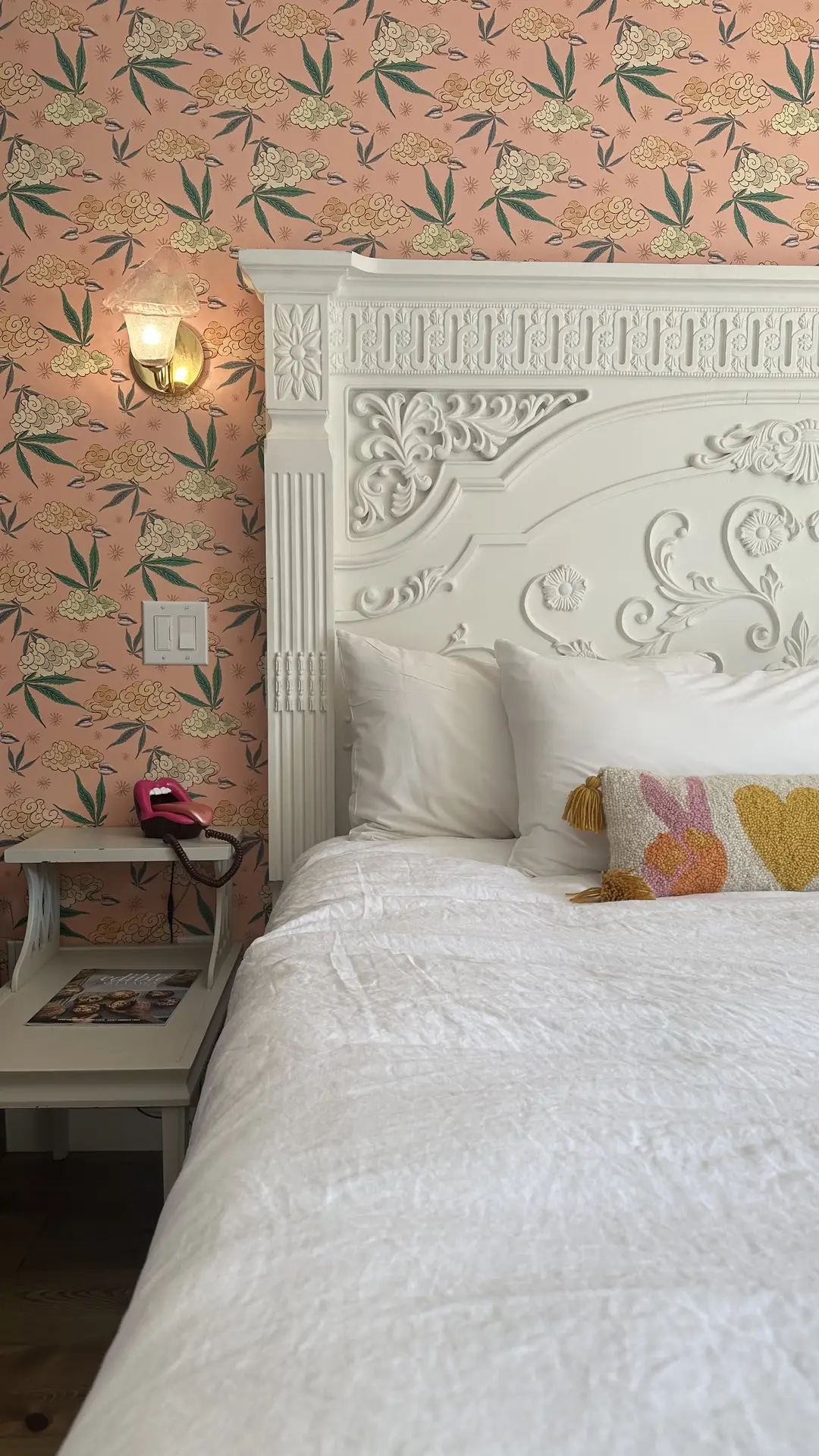
3. Patterned Wallpaper
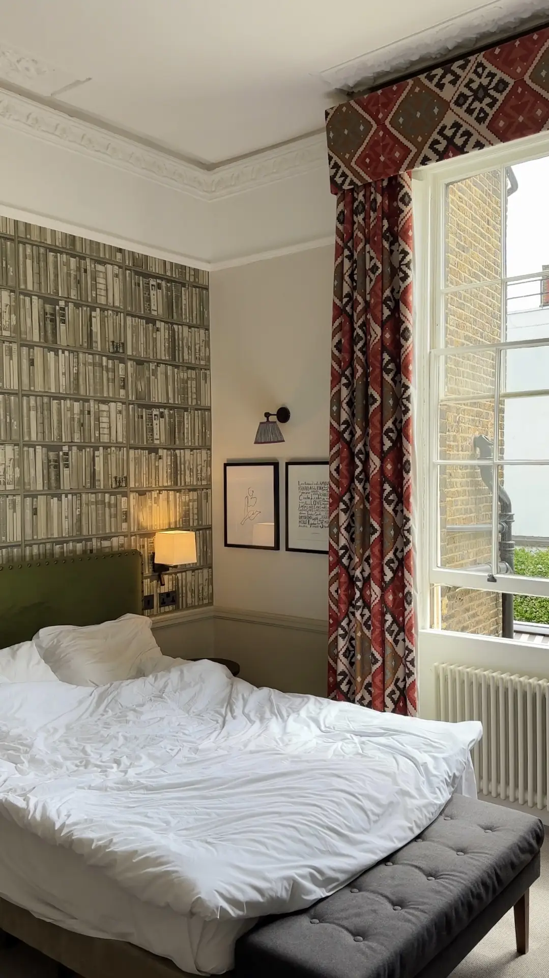 Save
Save Want to switch up your bedroom without just painting the walls? Patterned wallpaper could work.
I advice to go with softer, quieter patterns: Small florals, simple geometric patterns, so it doesn’t take over the whole room.
The trick is balancing it out with solid bedding, plain curtains, maybe some textured pieces here and there. This prevents it from feeling chaotic and lets you actually relax in there.
If you don’t just have a bookshelf printed on your wallpaper like in the picture above, but are still looking for inspiration on how to decorate your bookshelf, you’ll find some valuable tips here!
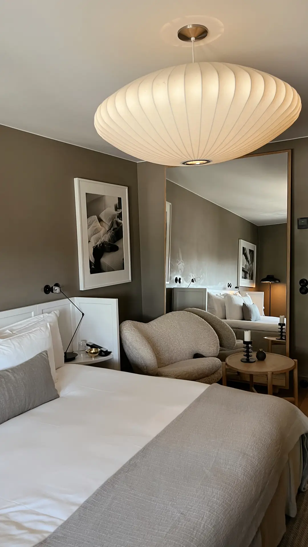
4. Greige
 Save
Save If you ask me, greige is the perfect in-between shade!
It feels warm in the morning light yet soft and airy during the day.
Plus: It’s versatile, because in my opinion you can pair it just as easily with white linens as with earthy wood tones or even a pop of muted blue.
I suggest to try adding a textured rug, linen curtains and a mix of throw pillows in complementary shades so the space feels calm but not flat.
5. All White
 Save
Save An all-white bedroom feels clean, bright and peaceful.
I like how simple it is, white walls with layered textures like a chunky throw, soft bedding and a wool rug.
That’s what stops it from feeling cold or sterile.
If you want more visual warmth, add some wood furniture, woven baskets, maybe a few plants. This makes it feel calm but not empty.
6. Dark Blue
 Save
Save Dark blue has that nighttime ocean vibe: Deep, calm, steady.
Really soothing.
I like it on one wall, then balance it with lighter stuff like white bedding, brass fixtures, wood furniture. This way it won’t get too dark.
Add some textured throws, soft lighting, maybe a patterned rug to warm it up. Otherwise the room can feel a bit heavy.
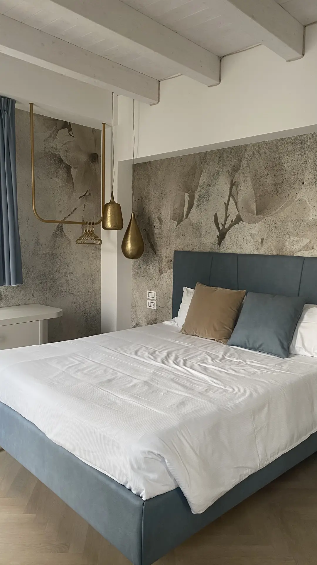
7. Anthracite – Paint Colors For Your Bedroom
 Save
Save Anthracite’s got that smoky depth going on.
Put it on one wall, then add warm neutrals, some oak furniture, maybe brass details. Otherwise it can feel a bit cold.
Throw in linen bedding, a wool rug, some lighter pillows if you want to soften it.
8. Effect Plaster/Trowel Technique
 Save
Save The trowel technique always gives me the feeling of soft movement on the wall, almost like shifting clouds or layers of stone.
In my opinion, it adds subtle dimension without being distracting.
In my eyes, this finish looks especially well in calming shades like greige or muted beige, creating a textured backdrop that still feels serene.
To make it shine, pair it with simple bedding, natural wood elements and a few warm-toned textiles.
9. Cozy Gray
 Save
Save You’re looking for a color that brings a gentle calmness without feeling dull? Maybe a cozy gray tone is the one you want?
Gray works beautifully as a base color that can be warmed up with wooden accents or brightened with white bedding.
My tip: Try layering in textured cushions, a chunky knit throw and warm lighting so the gray feels soft and soothing and not than cold.
10. Light Beige
 Save
Save Light beige reminds me of sand at sunrise.
It’s soft and natural and just adds a little something without being loud.
It works with basically anything: White bedding, wood furniture, soft pastels, you name it.
If it feels too plain, just add some texture. Linen curtains, a woven rug, neutral pillows. That’s all it needs.
11. Raw Wall For Industrial Charme
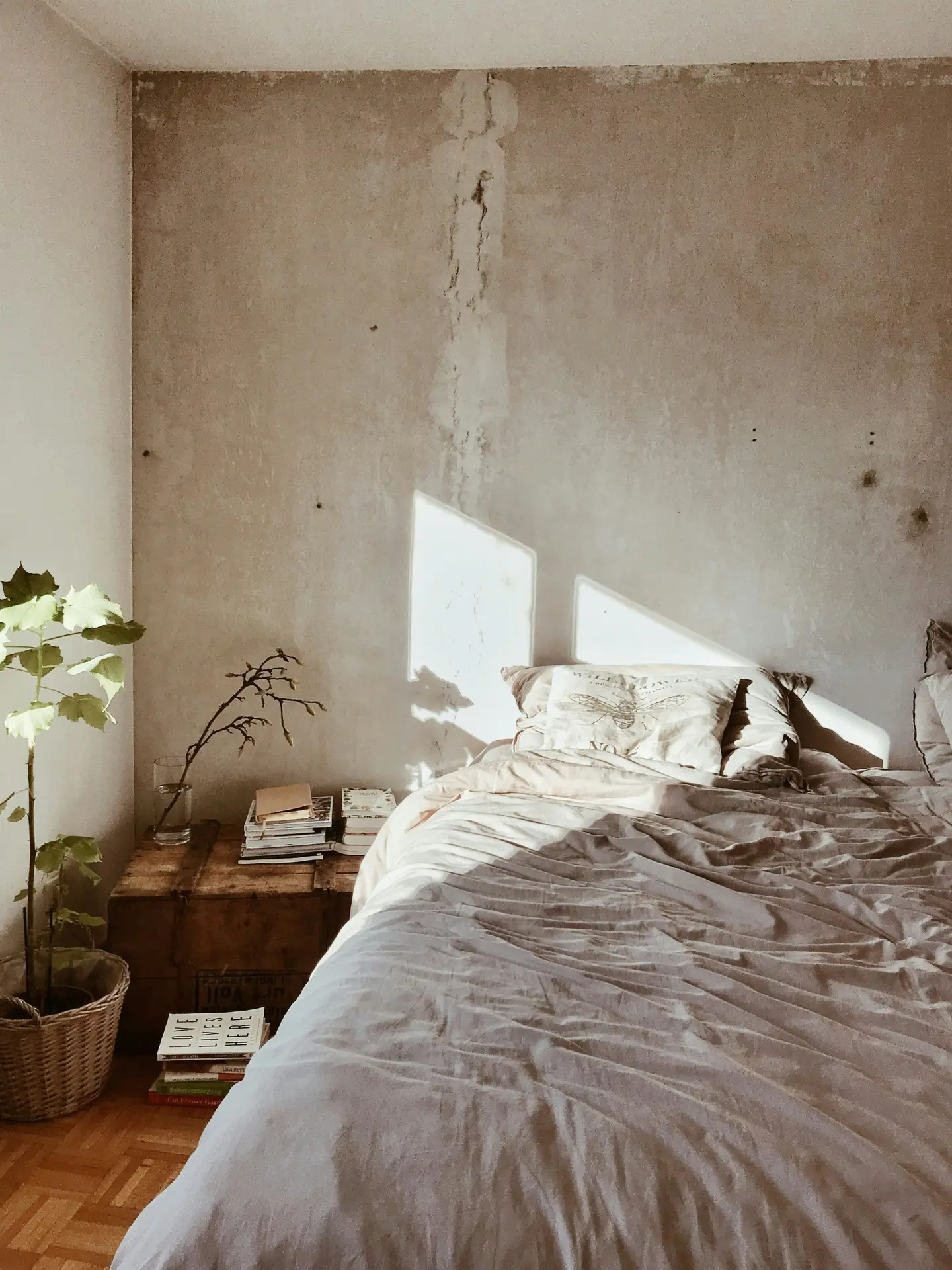 Save
Save A raw wall brings that industrial charme I often associate with loft apartments.
Leaving brick or concrete exposed can become the standout feature in a room.
I recommend to balance it with softer touches like cotton bedding, warm lighting or a plush rug.
My suggestion is to combine the raw wall with muted neutrals or deep tones on the other walls so the space feels edgy but still calm and relaxing.
12. Pink Floral Pattern Wallpaper
 Save
Save A pink floral wallpaper adds color and a bit of romance without being over the top.
It goes well with plain white bedding, a light wood nightstand and some fresh flowers to tie it in.
Keep your curtains solid and use textured throws so the wallpaper is the main thing and everything else stays calm.
13. Botanical Green With Gold Accents
 Save
Save You’re looking for something on your walls that feels rich, grounding and just a little bit glamorous?
Then this idea is just perfect for you!
I think this pairing looks great in a bedroom when you combine deep green walls or textiles with warm gold lamps, frames or hardware for a subtle touch of elegance.
I’d layer in neutral bedding, add a textured rug and bring in a few plants.
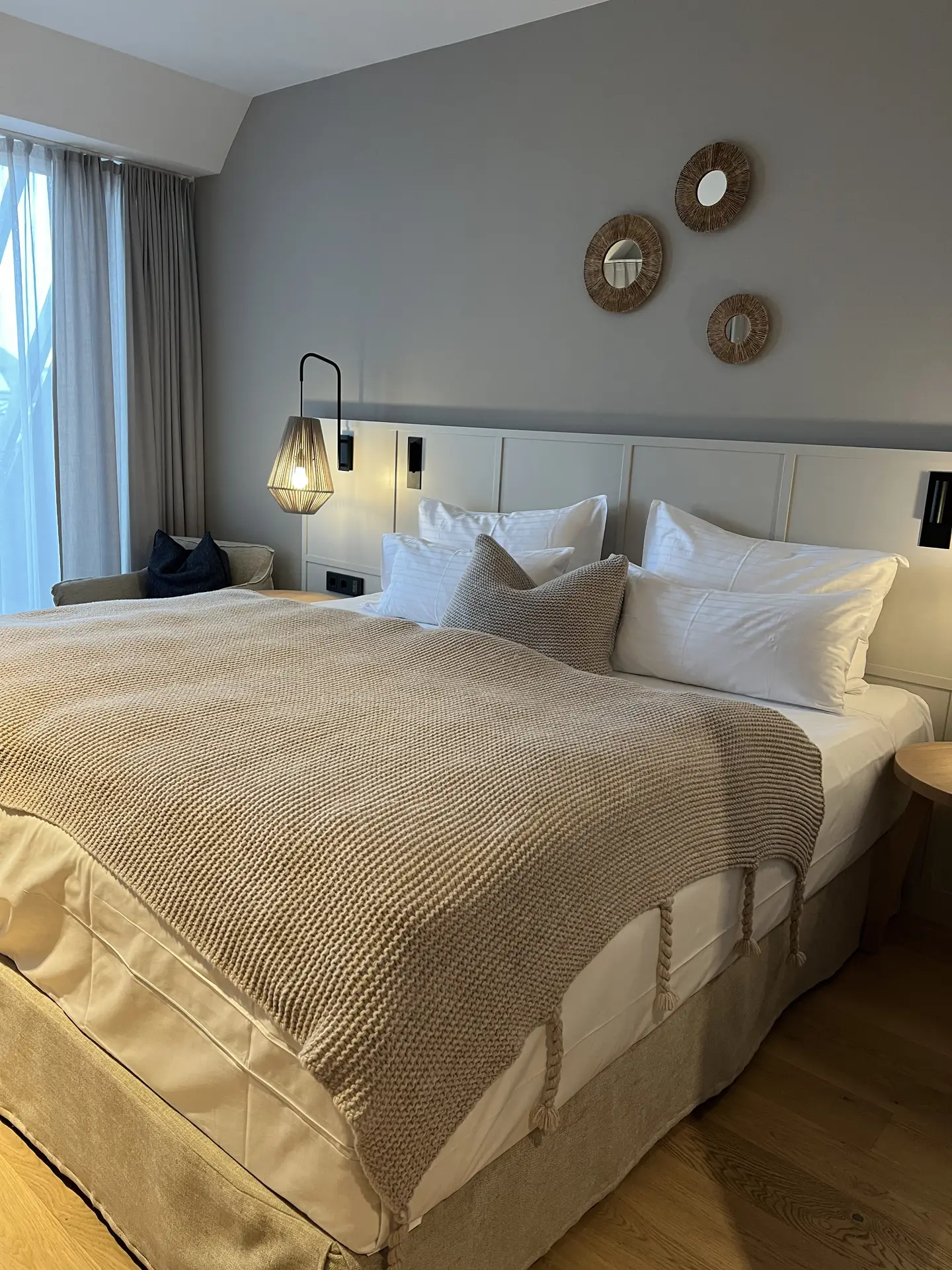
14. Light Grey – Paint Colors For Your Bedroom
 Save
Save Light grey feels calm, airy and easy to work with.
Pair it with textured bedding, a patterned rug and some accent pillows in muted colors.
The grey becomes a backdrop that doesn’t fight with anything.
It’s one of the most flexible colors honestly.
It works with white for a fresh look or with warm wood and soft fabrics for something cozier.
15. Calming Blue
Save Waking up in a room painted calming blue feels a bit like opening the window to a clear sky.
I suggest to pair it with soft white linens, light wood accents and maybe a touch of silver for a cool, airy balance.
Matching Textiles, Wood & Metals To The Pallet
When you actually start putting materials together, different fabrics, wood and metal, that’s when things click.
Use that 60-30-10 split: Most of it comes from walls and bedding, then furniture and rugs, then the small things like lamps and frames.
I always recommend to stick to one metal. If you pick brass, use it everywhere: Lights, handles etc. That looks way more pulled together.
And mix three different textures. Something smooth, something soft, something with structure. That’s what makes it feel dimensional instead of flat.
Make Small Rooms Appear Larger (With Color)
In small rooms, color is one of the best tricks for making things feel bigger.
Paint the ceiling a bit lighter than the walls, 10-20% or just a half shade up. This makes it feel taller immediately.
For storage, match the cabinet fronts to the wall color so your eye doesn’t stop at them. It all reads as one surface instead of breaking things up.
I’d also add some subtle vertical lines like panel molding or thin stripes to pull your eye upward and stretch the space out.
Put those together and a small room feels way more open than it actually is.
If you’re looking for more tips and tricks on small bedroom decor that makes the room feel spacious, this blog post will help you!
Test & Shopping Checklist
Before committing to a paint color, it’s worth running a quick reality check.
Colors shift dramatically depending on light, surface and surrounding textures, so testing first will save you from costly mistakes.
I’m gonna tell you: A simple shopping list makes the process easier! Here’s what you need:
- 2-4 paint samples
- Painter’s tape
- Neutral primer
- Sample boards or A4 sheets
- Microfiber roller
- Dimmer switch and bulbs
Once you’ve painted out your samples, jot down notes at different times of day: Does the shade feel fresh in the morning, a little flat at noon or slightly yellowish under evening light?
These small observations help you choose with confidence and ensure the final color matches the mood you want in your space.
Typical Pitfalls & How To Fix Them Fast
Even good color plans run into problems sometimes, but most are easy to fix.
Your room looks too gray or cold? Balance it with warmer trim and add wood or brass accents. This brings back warmth and depth.
Paint samples look patchy? Usually it’s the base showing through. Use neutral primer first and test with two coats to see the real color.
Colors look weird or shift at night? It’s probably your lighting. Get bulbs in the 2700-3000K range with a CRI of 90 or higher. Keeps colors looking consistent all day.
Final Brushstroke: Bringing It All Together
Choosing a paint color for your bedroom that feels calm and actually fits your style comes down to being intentional.
It’s about understanding light and LRV, layering textures and picking the right paint finishes.
I recommend to test things out, avoid the common screwups and pay attention to how wood, metals and fabrics work together.
Color isn’t just decoration. It changes how the room feels.
Take time to plan it out, try different things and adjust as you go. With the right decisions, your bedroom will feel comfortable and look good for years.
You need more home decor inspiration or organizational tips? Feel free to roam around my blog!
Did you enjoy this article?
If you’d like, treat me to a coffee ☕ Your support means the whole world to me!
The text is imbued with quiet wisdom, offering insight not through declaration but through careful observation and gentle revelation.